
Chinatown Planning Study
City of Toronto: chinatown planning study
I had the great pleasure of working with the City of Toronto to develop design assets and illustrations for an outreach campaign on Toronto’s Chinatown community, set to be initialized in 2022.
The branding package templates will each be adorned with illustrations that reflect the bustling and colourful nature of Chinatown’s streets and local businesses. Illustrated flyers, brochures, and social media posts will serve as visual communication to enhance visibility to capture the attention of the community.
Chinatown Planning Study: Outreach Campaign Logo
The logo in the branding package references Chinese seal stamps (“yìnjiàn” in Mandarin) in an illustrative style of Chinatown’s architecture. A Chinese knot that adorns the streetlamps of Chinatown is placed in the foreground of the design to create an attachment to the community. 2 versions of the logo were created, red and inverted.


Social Media / Word Document Template
The iconic red streetcar of Toronto is used as the main design motif in this template design. The illustration is meant to be used as an adornment for the bottom of social media posts and for word documents.

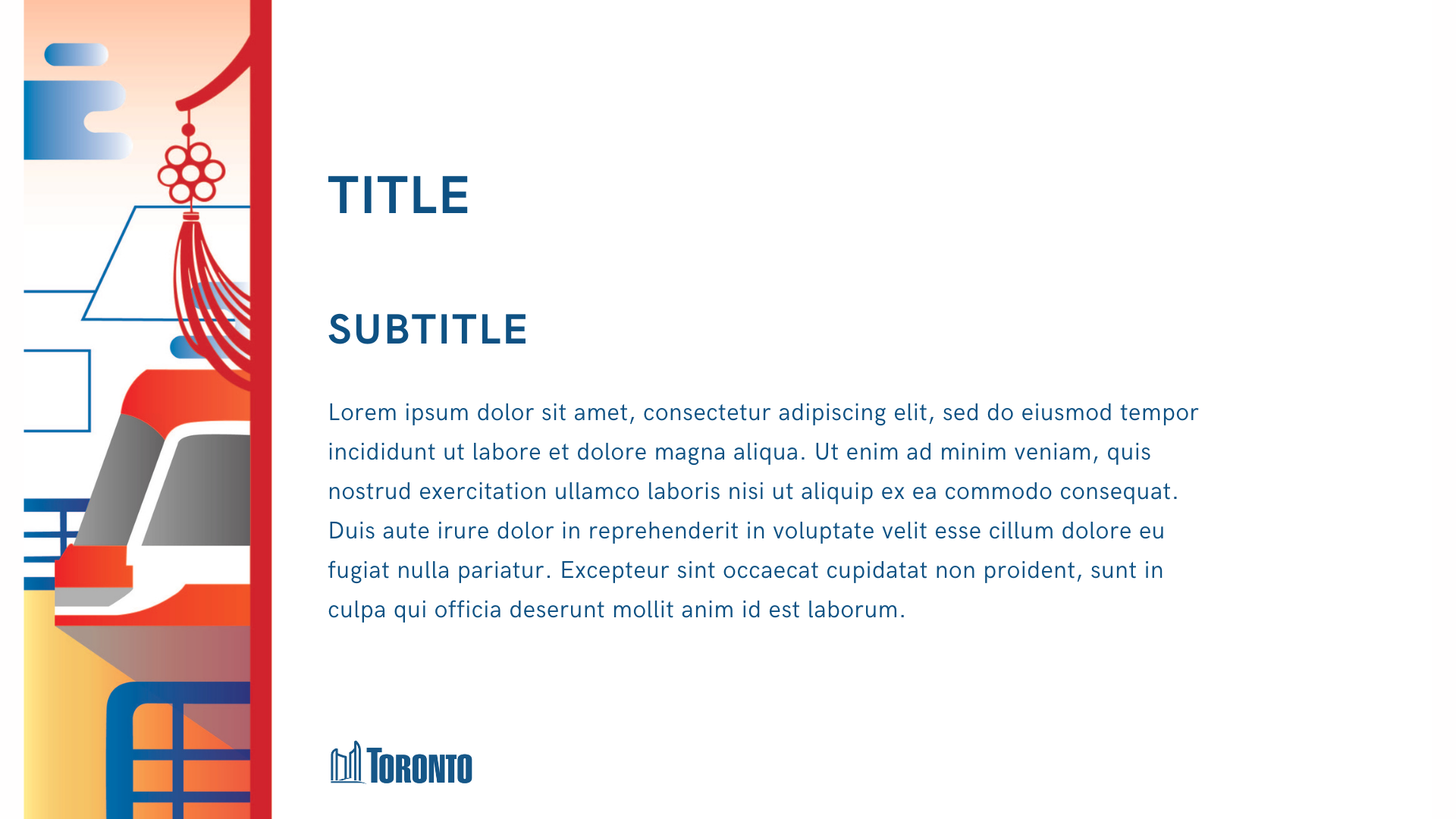
Powerpoint Template
In this template, the outreach campaign’s branding colours are used as a vertical banner to adorn the side of a powerpoint presentation.
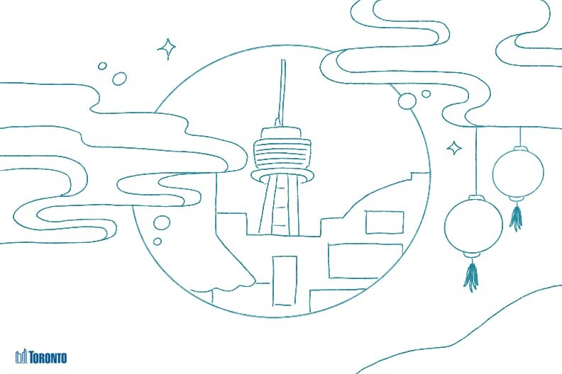
Postcard
Using the outreach campaign’s custom developed logo as well as iconic Chinatown motifs, an illustration was created that combines the essence and spirit of Chinatown in a postcard format.


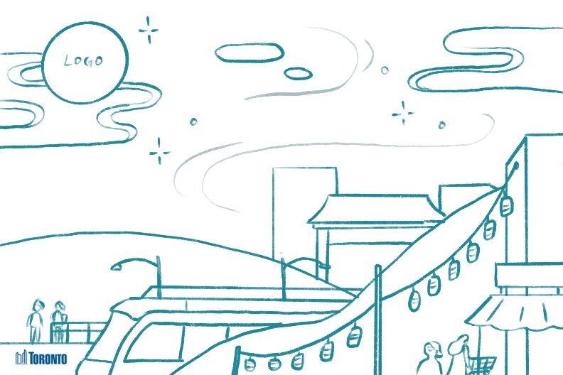
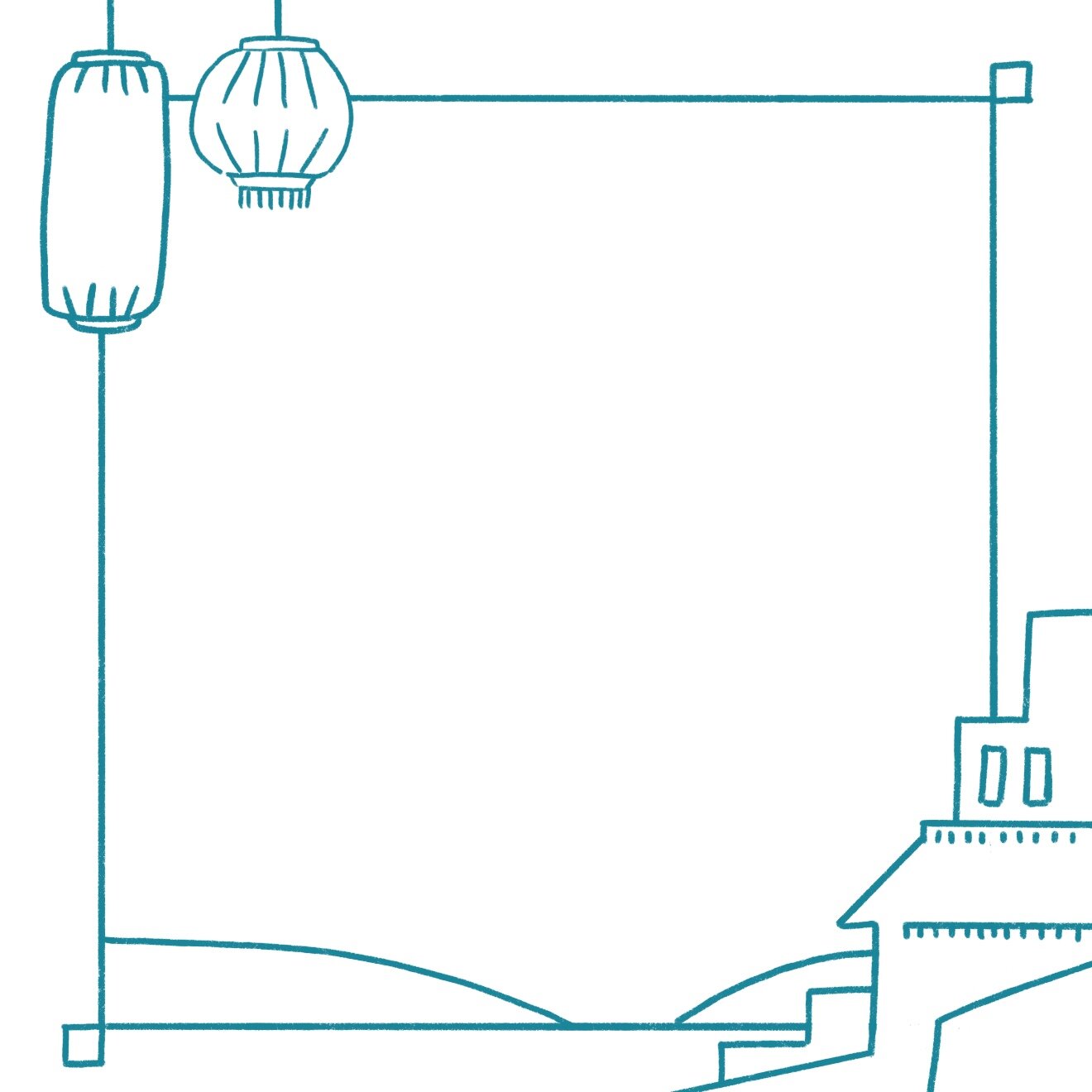
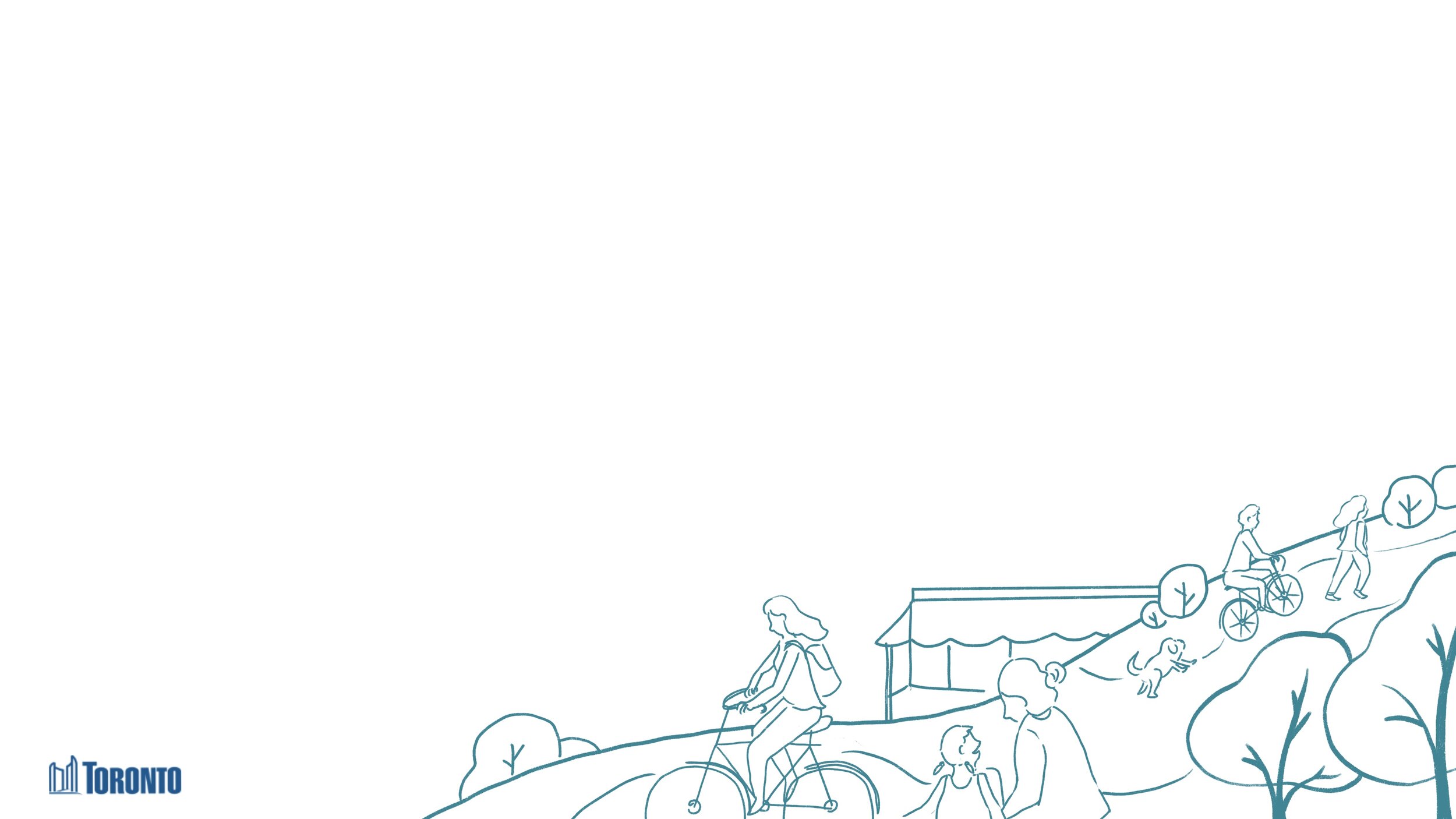
Process Work
Rough line art concepts to develop direction of project.