
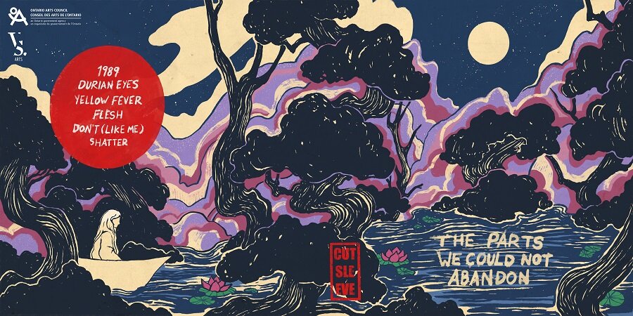
The Parts We Could Not Abandon: Album Cover
The Parts we could not abandon
cutsleeve album cover
album cover art
I had the great pleasure of working on the artwork for the debut album of the Toronto band, Cutsleeve.
We wanted the artwork to reflect the feelings of isolation, insecurity, temporality and uncertainty as a lot of their songs relate to being disconnected to our cultural backgrounds and conflict with navigating queerness, gender, belonging and family.
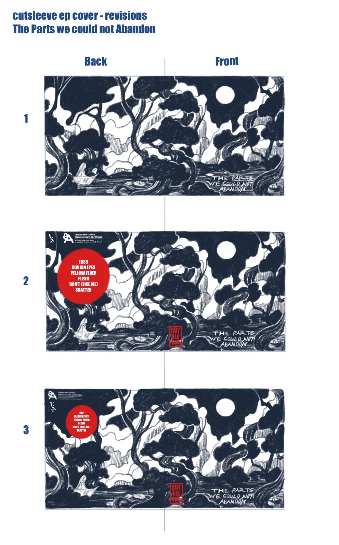
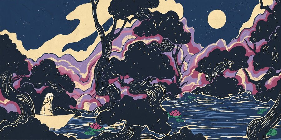
I suggested a wrap-around cover where the front and back covers of the album could be connected to show a full illustration.
The final album artwork is a wrap around cover with hand lettered typography in the title as well as the track list.
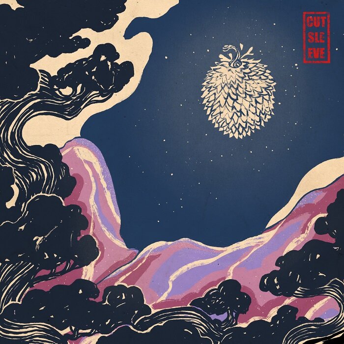
“durian eyes” single cover art
After finishing the final illustration for the album cover, cutsleeve reached out to me to create another illustration for their single, Durian Eyes.
They wanted a similar look as the album artwork and the same colour scheme to create a cohesive image altogether.
For this cover, I used a similar composition in the landscape and trees in the foreground with a durian glowing as the moon in the sky.
process work
For these initial sketches, I portrayed a landscape scene of a woman surrounded by tangled branches and trees as she navigates the unruly landscape by her boat. The title could be seen in the reflection of the water on the front cover. I wanted to make the moon on the cover something like the light at the end of the tunnel. This reflects the most important message cutsleeve wanted to communicate to the viewers, that they’re not alone in their feelings and there is support and numerous communities and resources to help us through tough times.
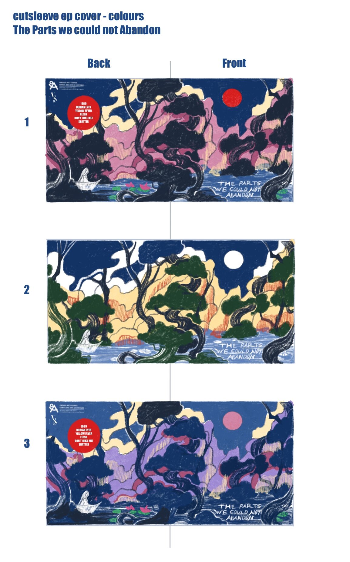
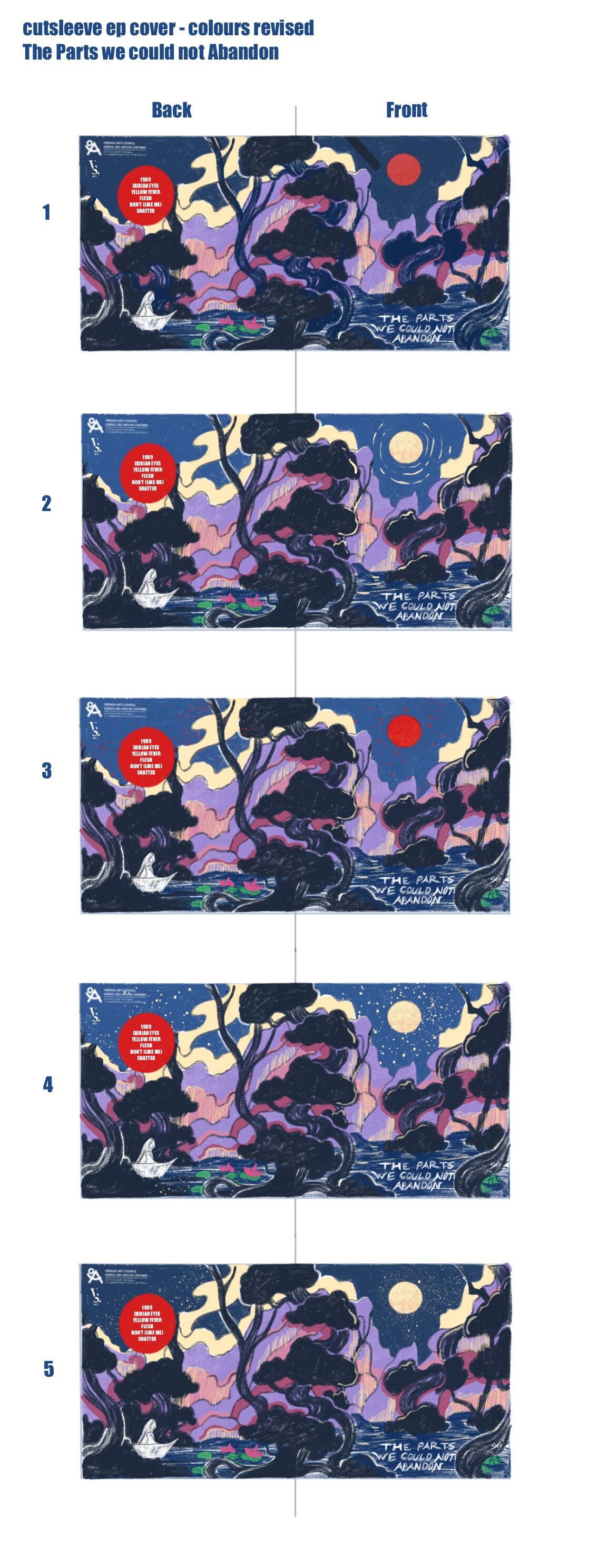
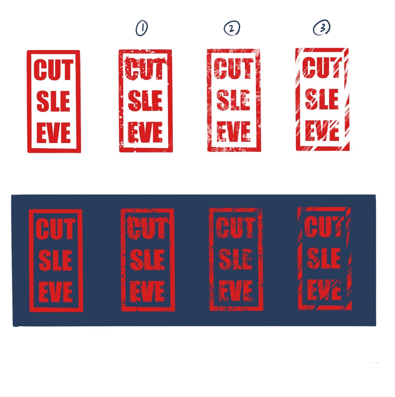
After approval of the initial sketch, I worked on colour studies. We went through multiple reiterations until we found the right colour scheme that portrayed the right feeling in the artwork. I also gave them multiple samples of logo designs of their band name as well as typefaces for the track list on the back.
I drew the approved sketch with ink on paper that I then scanned and coloured digitally to create the final illustration. I then overlaid the handlettered typography of the title and the track list on to the final illustration as well as accompanying sponsorship logos for the ready-print illustration.